A2 media short film
Tuesday, 23 April 2013
Friday, 19 April 2013
Preperation for posters and double page spreads
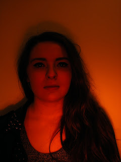
Here are some examples of the photos I took for my poster and double page spread. I explored with lighting and varied camera angles to finally decide what I wanted to use. I found and used a number of filters, and thought that the red worked well as it represented passion and danger.
Thursday, 18 April 2013
Updated double page spread
After also looking at my double page spread I have decided to produce a better version of that also making my frst attempt a draft.
NEW DOUBLE PAGE SPREAD
(BELOW)
As you can see there is several differences between my old draft double page spread and my new double page spread. I have made it more realistic by using websites on the page, also I have stopped the images crowding the page by framing them as well as bringing the poster forward witha frame.
|
Updated Poster
Having looked at my poster for the film, I decided to make some changes to make it look more professional, below is my new poster and then further below is my draft.
NEW POSTER (BELOW)
DRAFT POSTER (BELOW)
I think the decision to go with a darker red makes the poster ook more professional on the finished poster, where as it looks cheap on the draft with a lighter red. Also I have rearranged the poster in areas and put a proper certificate in the corner as oppose to the unprofessional one on the draft. As well as this I have incorporated my own tag line to further improve my finished product.
Subscribe to:
Comments (Atom)


